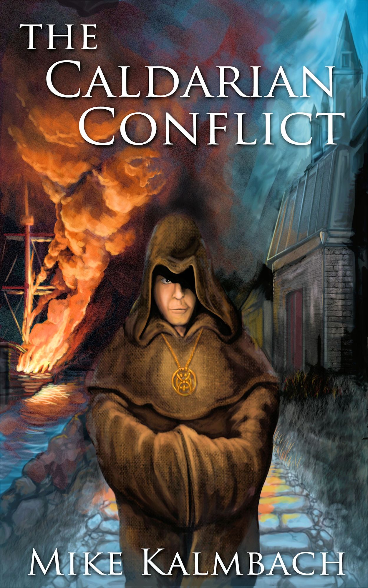
Book Cover for The Caldarian Conflict
Posted on July 3rd, 2011
After a lot of consideration, I’ve mostly settled on self-publishing my debut novel. For the past few weeks, I’ve been working with a cover artist, and here’s what we’ve come up with.
Thoughts (compliments and criticisms) are welcome and appreciated. There is still some time to make adjustments, but we’re pretty sure this is getting close to a final draft (click the image for a larger version).

What do you think? Please note anything you assume will be fixed in the final version–sometimes I might be blind to certain “artsy” things that should be adjusted.
Also, since I know not everyone is familiar with my book, here’s an initial draft of the back jacket copy. Note: This has been adjusted in response to Curt’s and John’s comments below.
“Pirates are a disease,” Admiral Cain often growls. He’ll stop at nothing to eliminate piracy from Caldaria. Luckily, Cain and his ruthless assistant Krell have finally landed on a seemingly perfect solution.
There’s a catch: if the Caldarian citizens discover what they’re doing, the peasants will revolt. If the king finds out, Admiral Cain will lose his head.
Brother Mendell, a monk dedicated to Lord Justice, is sucked into the battle when he consoles a pirate prisoner sentenced for execution. In his quest for justice, Mendell inadvertently finds himself at the forefront of a war between pirates and the Caldarian navy.
In order to bring the scales back into balance, Mendell must navigate deadly seas, survive traitorous pirates, and outsmart the devious admiral and his ruthless assistant. If he fails, the freedom of an entire nation lies at stake.
Comments on this summary are also welcome. Looking forward to your suggestions!
A few comments already received via email:
Criticisms:
o The monk’s hood is too wide.
o The monk’s face/hood is too blurry in a larger version. Shadow is fine, but blurriness is not.
o The water should be more realistic–it’s missing white caps on the waves, etc.
Suggestion:
o Turn the ‘L’ in Caldarian and the “o” in Conflict into a noose.
Another comment via @AnyLameName on Twitter:
Thanks, Jay!
Comment via Katie on Facebook:
Thanks, Katie. Great feedback!
Comment via Grady on Facebook:
Great feedback, Grady! Much appreciated.
Comment from Joan via Facebook:
Yeah, I agree. The hood really needs to be slimmed down. I’ll definitely let the artist know.
Comment from Ellen via Facebook:
Very appreciated! This is exactly what I’ve been looking for. Grateful for the details!
Like to see your text clear of your design at top and bottom. You’ve got visual conflicts going there, with text riding into the masthead and the monk. A bit of separation would make both elements jump out more and make it much cleaner. (This is something I see in most self-drawn and published designs. It doesn’t really work well – you don’t really have three-dimensional separation in that two-dimensional layout unless you’re actually going to emboss the type and outline it.)
Shrink your graphics a little and you’ve got it. Or go with smaller fonts on both blocks; move the title up and left a little and make the name go down and right. Just don’t let the words step on the artwork.
Also seems to me that even with the slight list, the waterline should be higher on the starboard side. She’s riding awfully high and empty; if they’re pirates, they’re not very good ones.
Now having pummeled the details, MAJOR congratulations on getting the Jolly Roger blowing in the correct direction. I’m always amused to the point of hysterics by the sight of a sailing ship with the jack streaming proudly back from the masthead.
Thanks a ton for the feedback. Always love to get advice from experts! The text running into the masthead bugged me a little too, and I think you nailed why.
And they are riding a bit high, but the intention was that they were headed out for plunder. I think you’re right, though…the water should still be a bit higher on the starboard side. Much appreciated!
From @LynNerdKelley on Twitter:
Thanks for the feedback! Much appreciated.
From Curt via Facebook:
Thanks!
The back cover text should be a teaser, not a summary. You give away way too much info. It’s also about twice as long as it should be — about 2 paragraphs is plenty for the backpage teaser.
Perhaps something along the lines of:
After centuries of dealing with pirates ambushing merchants in the Shalladian Sea, the Caldarian navy leadership will do anything to eliminate the problem. Admiral Cain and his ruthless assistant Krell have finally landed on a seemingly perfect solution. There’s a catch: if the citizens of Caldaria discover what he’s doing, they will revolt. If the king finds out, Admiral Cain will lose his head.
Brother Mendell, a monk dedicated to Lord Justice, is sucked into the battle when he consoles a pirate prisoner sentenced for execution. In his quest for justice, Mendell inadvertently finds himself at the forefront of a war between pirates and the Caldarian navy.
In order to bring the scales back into balance, Mendell must navigate deadly seas, survive traitorous pirates, and outsmart the devious admiral and his ruthless assistant. If he fails, the freedom of an entire nation lies at stake.
Thanks, Curt. Good point. I’ll take a closer look and see if something else should be removed/adjusted with your recommendations. Much appreciated.
Anything I might have said about the cover has already been said in the comments above, but I like it. I also like the sound of the story, it is definitely something I would try.
My only gripe, and I’m not sure how you fix this (if I was, I’d be applying for a job in publishing), is that the back-of-the-jacket copy could do with a little more “punch.” I read the whole thing because your a twitter friend and, because I read it, I found that it’s a story I’d be interested in, but if I’d picked the book up in a shop, or looked at it on Amazon, I’m not sure I’d have read the whole blurb before moving on.
Agreed. The blurb is missing something. I’ll play with it a bit more. Thanks for the feedback!
[…] you can find information on Mike’s upcoming novel here. Now, onto the blurb. Luren didn’t remember the night her parents […]
I know its too late but I just stumbled upon this post, aside from what everyone else has said, the pirate flag seemed a bit hard to make out, maybe bigger or more crisp contrast between the black and white?